Monday, 5 March 2012
Research into simililar products: horror magazine analysis
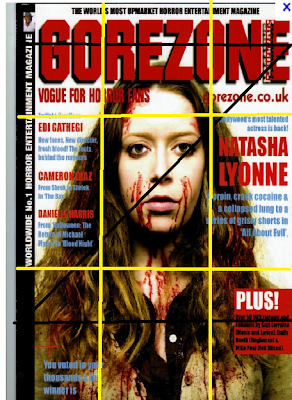
This is a Movie magazine, called Gorezone. The typical conventions of a magazine layout do conform to this magazine such as the masthead is at the top, in the centre and as you can see the route of the eye runs along it and its in red bold letters which makes it stand out.
The magazine has one main image which is the background to the magazine but is also Central to make it catch the readers eye. The image's face is in the centre of the principle of thirds this is conventional to a magazine layout because it creates an order to the magazine but centres the model and makes her dominant and stand out.
The magazine also has typical conventions of the horror genre for example it uses the colour red for the masthead with black outline these colours are linked with horror because red indicates danger and blood and black connotes darkness. The font used is also bold making it very dominant. The picture used also is connotes the horror genre as they have used a pale female model with blood on her face, by making her pale it makes her look ghostly and by having a female connotes naivety and vulnerability and the blood indicates danger and the horror.
Labels:
Research
Subscribe to:
Post Comments (Atom)

No comments:
Post a Comment