Monday, 12 March 2012
Tuesday, 6 March 2012
Audience Feedback Questionnaire
Create your free online surveys with SurveyMonkey, the world's leading questionnaire tool.
Monday, 5 March 2012
Research into simililar products: horror magazine analysis
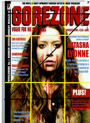
This is a Movie magazine, called Gorezone. The typical conventions of a magazine layout do conform to this magazine such as the masthead is at the top, in the centre and as you can see the route of the eye runs along it and its in red bold letters which makes it stand out.
The magazine has one main image which is the background to the magazine but is also Central to make it catch the readers eye. The image's face is in the centre of the principle of thirds this is conventional to a magazine layout because it creates an order to the magazine but centres the model and makes her dominant and stand out.
The magazine also has typical conventions of the horror genre for example it uses the colour red for the masthead with black outline these colours are linked with horror because red indicates danger and blood and black connotes darkness. The font used is also bold making it very dominant. The picture used also is connotes the horror genre as they have used a pale female model with blood on her face, by making her pale it makes her look ghostly and by having a female connotes naivety and vulnerability and the blood indicates danger and the horror.
Analysis of a Front cover Horror Magazine
The layout of this magazine is very typical for that of the conventions of a horror magazine. There is a main image which takes up the whole right hand side and centre of this magazine this is letting the audience know the magazine focuses on this image. The image is from scream which is a well known horror film having this image in the centre means it stands out and 'scream' fans will see the magazine and want to buy it. The magazine uses three more smaller images to the left of the magazine this makes the magazine appeal to a wider audience as anyone that can relate to those pictures will also want to buy it.On the left hand side with the pictures there is a stereotypical movie board picture used this fits in with the magazine as its a film magazine and its an easy way to let the audience know that as well.
The masthead runs along the top with the route of the eye this means its the first thing that's seen its stands out as its in bold red writing, red contrasts the black background and red also connotes blood which relates with the horror genre. Above the masthead in yellow is a freebie by having it above the masthead the dominate part of the magazine means it will be seen especially as it runs with the route of the eye and putting it in yellow contrasts both the red and black making it stand out.
Also below the masthead is bullet points of what else is inside the magazine these are in yellow as well to make them stand out against the bold masthead and yellow contrasts the red and black.
Also below the masthead is bullet points of what else is inside the magazine these are in yellow as well to make them stand out against the bold masthead and yellow contrasts the red and black.
The fonts used are all quite basic sans serif to make the magazine easy to read, the colour scheme connotes the horror genre well with red representing blood, yellow, danger and black death.
Subscribe to:
Comments (Atom)


